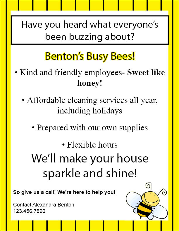
Design #1. Business Flyer For the business flyer I created, I wanted it to look "fun" and "cutesy." I tried to think of name with good alliteration and came up with "Benton's Busy Bees." So, going off the title of my business, I thought of some phrases that went along with my theme of bees-"...buzzing about" and "sweet like honey." Furthermore, I wanted to make the flyer easy to read, with the most important information catching peoples' eyes first. So, I made the name of my business bold, with a hint on a yellow stroke around it to make it pop out more. I also put "We'll make your home sparkle and shine!" in even bigger bold letters so people would know what service I provide right away. I tried to keep the flyer as simple as possible without it being boring-I did not want it to be too cluttered. This is why I made the border of the page a bumblebee yellow, and I added the black stripes to keep the bee theme. I also put the question at the top of the page in a box to give the page more structure. The reason I went with a "busy bee" theme is because I thought the audience most interested in this flyer would be new mothers, parents of more than one child, single parents, etc. The bee I put on the flyer is smiling, and I think that adds a warm, friendly feel to the flyer.
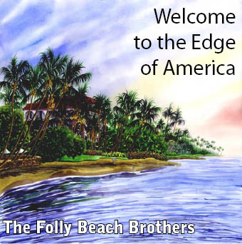
Design #2. Music CD Cover I wanted to make the CD cover look soothing to reflect my fake band's mellow melodies. And since my band is the Folly Beach Brothers and I am so desperate for summer to get here already, I thought it only fitting to have the cover be a beach/ocean scene. For the back cover, I used the same picture, blown up some so that most of the page was sky, with a few of the palm trees in the left bottom corner. This is so I would have enough room to write the names of the CD's songs. I placed the logo, record label name, and copyright information in the left bottom corner in a much smaller font because I did not want peoples' eyes instantly drawn to the record label; I wanted their eyes to be drawn to the tracks on the CD. I wanted the titles of the tracks to reflect a summertime feeling-a little bit of a reggae feel and a little bit of a Beach Boys feel. Although my CD cover is very simple, I think it reflects on what we have learned in class about design principles. I made sure the text was readable, I kept the pages balanced, and I did not clutter up my pages with too much unnecessary stuff.
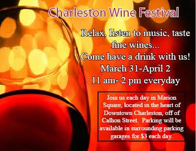
Design #3. Advertisement - Promote your organization's event With this project, I tried to contrast the dark colors of the background photo with the white lettering and stroking of the various text boxes. The title I decided to make a burgundy wine red color with a white stroke. All the other text was white lettering so people would know that it was the description of the event. I made the times and dates large so it would catch your eye at first glance. And if that made someone interested in the flyer, they would read on to find more specific details about the event. I also included the persuasive "come have a drink with us" line to lure people in. In class, we discussed how to make text pop. For this specific design, I tried both adding a drop shadow and adding a stroke, and adding a stroke seemed to look better than adding a shadow. Also, with this event card, I framed the wine glass with the text. So not only to readers see the text right away, but they also see the shape of a wine glass. One thing I could have done differently, though, is added sponsors to the card to let people know what brands of wine to expect and what type of music to expect.
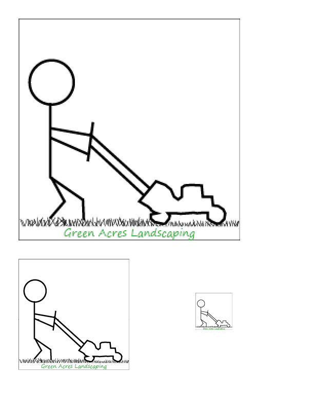
Design #4. Company Logo I chose to design a logo for the fictitious Green Acres Landscaping Company. The first thing that came to mind when I read the company name was someone mowing the lawn. So, I created my own stick figure man using the elliptical tool and the line tool and then drew the lawn mower using the pen (very tedious work!). To make the grass, I used the line tool and randomly drew lines below the man and his mower. I placed a white rectangular box underneath the grass so that the bottom of the grass would be even and wrote the company's name in the box. I made the name green because green is in the title of the business. When I shrunk the logo down to 3x3 inches, it still looked very good. Then, as I shrunk it down to 1x1 inches, the text became a little more difficult to ready, but the image still looks good. People will be able to see the drawing and think to themselves, "OK, there's a man mowing the grass, so it must be a landscaping company." And then they will be able to look closer and see that it says "Green Acres Landscaping."